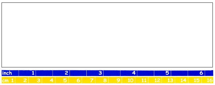
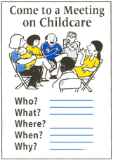
This screen is a quick way to check draft reports, letters and other documents printed on 8.5 x 11 inch paper.
 Font Size
- Count the number of words in several sample lines. If there are
15 words or more, your font is too small.
- Count the number of text lines and spaces within the window
of the screen. If
there are more than 11 lines and spaces within
the window, increase your font
size.
- Use a 12 point font or larger.


 Font Face
The letters in your sample should have "serifs," the little hooks on each letter. A serif font
like Bookman or Garamond face is easier to read. Use "sans serif" fonts, such as Arial,
for headings and captions.
 Text Density
White space on the page breaks up dense text and makes the content more readable. We
should also have:
- space between paragraphs
- highlighted headings
- bulleted or numbered lists
- pictures.
If your sample has no white space, edit your text into shorter paragraphs.

 Pictures
Illustrations make documents more attractive.
A picture or graphic can be worth a thousand words.
Make sure pictures:
- are clear and placed with the text they illustrate
- reflect your readers and are inclusive.
 Font Size