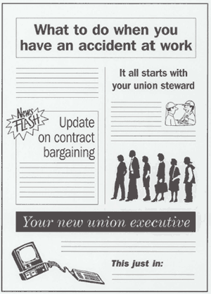
Text that is centred or ragged on both sides doesn't show the reader where sentences begin and end. It looks like each line is a sentence in itself.
(This paragraph is centred.)
Text density and white (blank) space
There should be enough white space on each page.
A page with ample margins and headings that divide the
text is easier to read.
It is
also more visually appealing.
Choose colours that provide good contrast. Black type
on
light coloured paper
is the easiest to read. Text on bright
orange, pink or green paper is hard to read.
Dark type
+
dark paper
=
difficult reading
Consider the following questions when deciding about adding illustrations to a text:
- from Illustrations and Graphics Questions, by Betty-Ann Lloyd.

Don't include too many of these elements on a single page:
Too many design elements don't give the reader a clear focus. In fact, they make it harder for the reader to scan and pick out information.
Don't start a new story or topic at the bottom of a page. Try not to have sentences, or even paragraphs, carryover to a new page. If you must make your copy break to continue on another page, then do so at a logical place. This may take some last-minute editing at the layout stage.