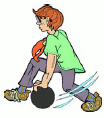

Pictures of people, whether clipart or photo, should mirror the reader. I’ll explain what I mean.

People with developmental disabilities usually have very limited incomes. Because of this, pictures should show ordinary people doing ordinary activities. For instance, few people with developmental disabilities go downhill skiing. They are more likely to get their exercise by walking, swimming in a local pool, or bowling.


They will seldom, if ever, have the opportunity for a trip to Paris, so, if you are writing about vacations, avoid showing the Eiffel Tower and focus instead on West Edmonton Mall or visiting relatives or camping, or maybe even Disneyland. For eating out, choose pictures of cheerful diners rather than fine restaurants. Choose burgers and fries rather than unusual vegetables like artichokes. Skip the waiter carrying a bottle of wine.
(I am, of course, generalizing here. If you are writing for an individual or group which you know takes trips abroad or out to fancy restaurants, for sure pick more glamorous pictures.)

Avoid symbols unless they are essential, in which case write beneath them what they represent. A red circle around two cars means nothing unless the readers have learned it (and remembering how few people with developmental disabilities drive vehicles, learning road symbols is not often a high priority).


Other symbols too can be hard to understand. If you asked someone what a picture of a finger with a string tied around it means, your answer would likely be “it’s a finger with a string tied around it.” The symbolism (of the string as a reminder) has been added to the literal meaning and many have not learned it. The old “light bulb over the head” symbol is sometimes OK to use, as it has been seen so often in cartoons that many people “get it.”
[Doubtful picture choices are on the left, better ones on the right.]