|
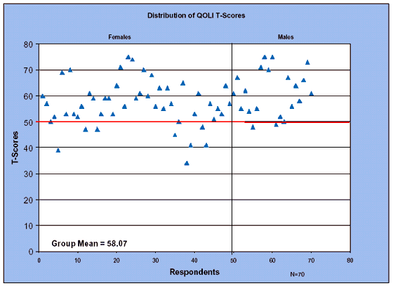
The Inventory yields several different types of scores. Appendix B contains additional QOLI tables and charts delineating P-values (percentiles) and T-scores. T-Scores represent participant levels of satisfaction when compared to the general population. Chart 10 presents a Scattergraph that shows the T-Score data for each of the 70 participants in this study. The heavy line at 50 represents the average QOLI score for the general population. Each triangle above that line indicates a participant whose total QOLI score was greater than that of the general population. This type of chart tends to make it easy to visualize the overall distribution of scores of all participants in the group in a way that numerical tables fail to reflect. Scattergraph of QOLI T-Scores for Total Group
It is obvious from Chart 10 that the majority of participants were above average in overall Tscores on the QOLI with a mean (mid-point) of 58.07 for the participant group. Only two individuals had scores lower than –1 Standard Deviation while 10 individuals’ scores were greater than +2 Standard Deviations from the mean. The mean T-score for Females was 59.22 and the mean for Males was 55.38. The QOL Inventory also provides a descriptive classification for total scores. The following system is used in assigning classifications. Chart 11 shows the distribution by category for the total group of participants.
|
| Previous Page | Contents | Next Page |