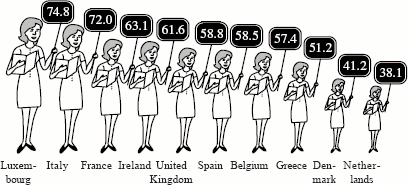
FEW DUTCH WOMEN AT THE BLACKBOARD
There is a low percentage of women teachers in the Netherlands compared to other countries. In most of the other countries, the majority of teachers are women. However, if we include the figures for inspectors and school principals, the proportion shrinks considerably and women are in a minority everywhere.

Percentage of women teachers (kindergarten, elementary, and secondary).
Another task receiving a difficulty value of 242 is very similar to the one discussed above. This item directs the readers to look at two charts involving fireworks in the Netherlands and to identify the year in which fireworks injured the fewest people. This task also was rated a 3 for type of match because the readers had to first identify which of the two charts contained the requested information. Then they had to cycle through the points of the graph to locate which point represented the fewest injuries. Using this point, they then had to identify the correct year. Type of information received a score of 2 since the requested information was time, and plausibility of distractor received a score of 2 because there were other years the reader could have selected.
A somewhat more difficult task (with a difficulty value of 295) involving the fireworks charts directs the reader to write a brief description of the relationship between sales and injuries based on the information shown. Here the reader needs to look at and compare the information contained in the two charts and integrate this information, making an inference regarding the relationship between the two sets of information. As a result, it was scored a 5 for type of match. Type of information received a 4 because the requested information is asking for a pattern or similarity in the data. Plausibility of distractor was scored 3, primarily because both given and requested information is present in the task. For example, one of the things that may have contributed to the difficulty of this task is the fact that the sales graph goes from 1986 to 1992, while the injuries graph goes from 1983 to 1990. The reader should have compared the information from the two charts for the comparable period of time.