| Before |
After |
You can qualify for benefits under
Section 43 if you
are sixty-four or older
and unable to work, and that
section
also provides benefits in the event that
you
are blind in one eye, or both eyes,
or are permanently
disabled in the
course of your employment. |
You can qualify for benefits under
Section 43 if you meet anyone of the
following conditions:
- You are 64 or older and are
unable to work, or
- You are blind in one eye or
both eyes, or
- You are permanently disabled
in the course of your
employment
|
To emphasize particular content, use:
- bold or italic type
- a different but complementary type style
- subheadings
- shading
- illustrations
- text in boxes
Be sure that information in a box makes sense all by itself. Readers may read only this
information.
TYPE STYLES
Serif and sans serif

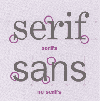
There are two broad categories of type styles: serif and sans serif.
- Serif type has "hooks" or "feet" on the letters, like the type we're using in this
text.
This is Century Schoolbook, a serif type style. It is an easy text type
to read.
- Sans serif type has no hooks.
This is Helvetica, a sans serif type style. It is not as easy to
read.
- The hook, or serif, helps the reader's eyes move along
the line of type. Serifs also give the reader more
information about the characteristics of each letter. This
makes the letters more recognizable and easier to read.
Serif type styles are usually your best choice for text
type.
- Sans serif type styles draw the eye down into the text that follows. They are
helpful for headings, tables and charts that you want to highlight from the
main text. They are also useful when you have to use small type, such as in
photo captions.
Keep it simple
Avoid complicated type styles.
- The style for the text should be clear and simple.
- Use styles consistently: one for titles, one for sub-titles, one for text. Avoid
using more than three type styles in the same text.
TYPE SIZE
Text type
Readers generally find 12 point type easy to read for text. You might want to use 13
or 14 point type, depending on the type style.
Headings, or display type for flyers, posters and other promotional materials are
usually 18 points or larger. The larger size is used to attract the reader's attention.
This is 12 point. This is 14 point. This is 18 point.

