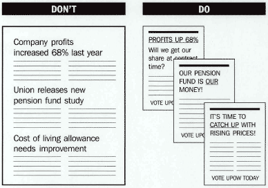
A leaflet with multiple themes compared to one with a central theme

Use one central theme per leaflet.
A leaflet is most effective when you stick to one major theme. If you have other major points to cover, consider doing separate leaflets for them. When doing several leaflets on the same subject or in the same campaign, vary the design but tie them together with a common type style, logo, colour, style of illustration or repeated slogan.
Don't use too much text.
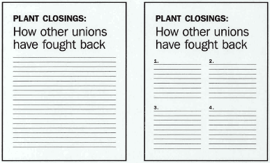
The whole idea of a leaflet is that it is inviting to read because it is short and to the point.

A leaflet using too much text compared to one that gets straight to the point

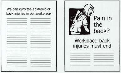
Use cartoons, photos, charts or other illustrations.
They can make the leaflet more attractive and help get the point across.

A plain leaflet compared to one with images